Monday, September 26, 2011

Belletristik


Slightly bigger Version

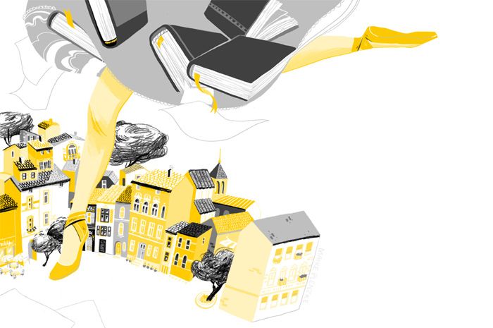
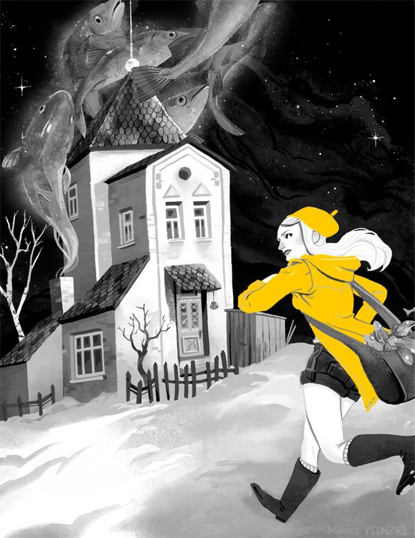
In August I did these two pieces for the German Literature Magazine "Belletristik". I had to illustrate two poems, which were really odd, but that actually allowed me to be really free with the idea for the drawings.

The Belletristik is usually printed in black and a color, which is different in every issue. This time it had to be a yellowish orange. Therefore I had to work with seperate layers for the two colors, which I normally don't do.
The two poems didn't belong together so I was able to try two different approaches. The first illustration has a lot of shades of yellow in it and some pencil-lines whereas the coat is the only yellow part in the second illustration which is completely digital.
Wednesday, September 14, 2011

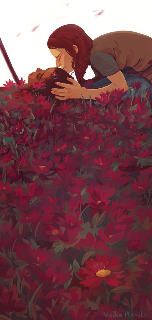
The Hunger Games: Another illustration


I found this thumbnailsketch in my sketchbook and decided to do a proper illustration for this scene.

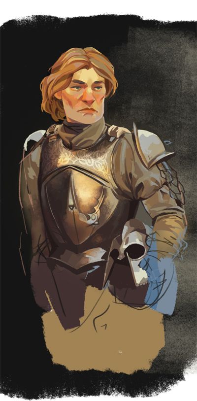
Study of an armor

Sometimes I do those studies to see how I can draw certain things in this relatively flat style. Especially metallic things are still hard to do for me. So I did this study of the Kingslayer from a photo from HBO's Game of Thrones. I was not going for likeness, but rather tried out different possibilities to describe shining armor. First I used textured brushes on the front plate, which looks kinda good, but is also a bit too realistic for me.
So I used a differnt approach on the helm... which I like better.